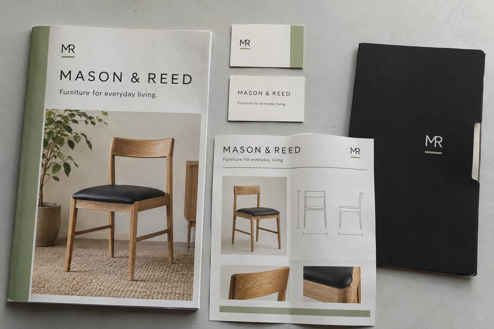
 Independent concept
Furniture business · Brand identity concept
A straightforward online-store concept for a fictional luggage business. Clear product choices, practical details, and a visual identity that travels well.
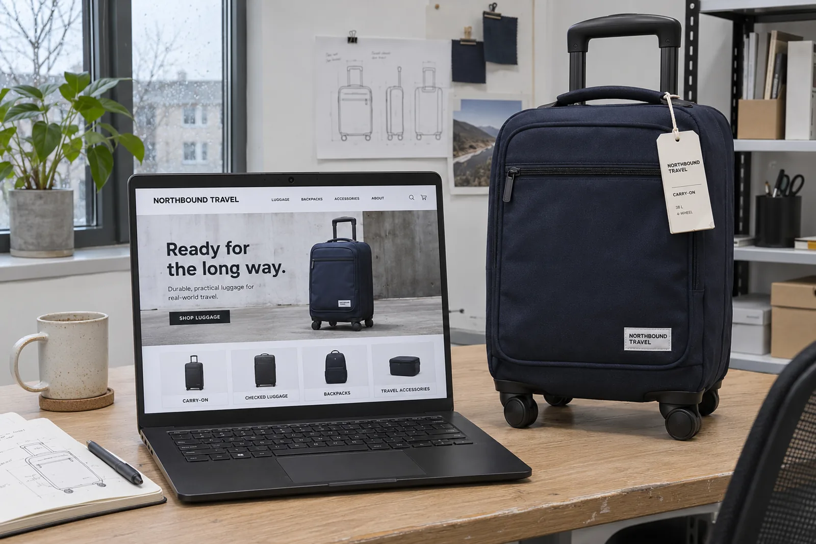
Independent concept · Fictional brand · AI-generated application imagery
Make a varied luggage catalogue easy to browse without burying the practical details people need to compare products.
A simple black wordmark, navy product photography, and a clear shopping hierarchy create a consistent desktop and mobile direction. The study explores product discovery and presentation rather than a live store.
This is a visual direction, not a shipped product. There are no client results, performance metrics, or testimonials associated with this study.
A distinctive mark.
A world built around it.

Navy#202B3C
Ink#202020
Paper#F2F1ED
Grey#A9AAA6
A compact, plain-speaking wordmark that stays readable on a screen, a woven label, or a paper hangtag.
A direct sans-serif hierarchy makes the product name, useful details, and next action easy to find.
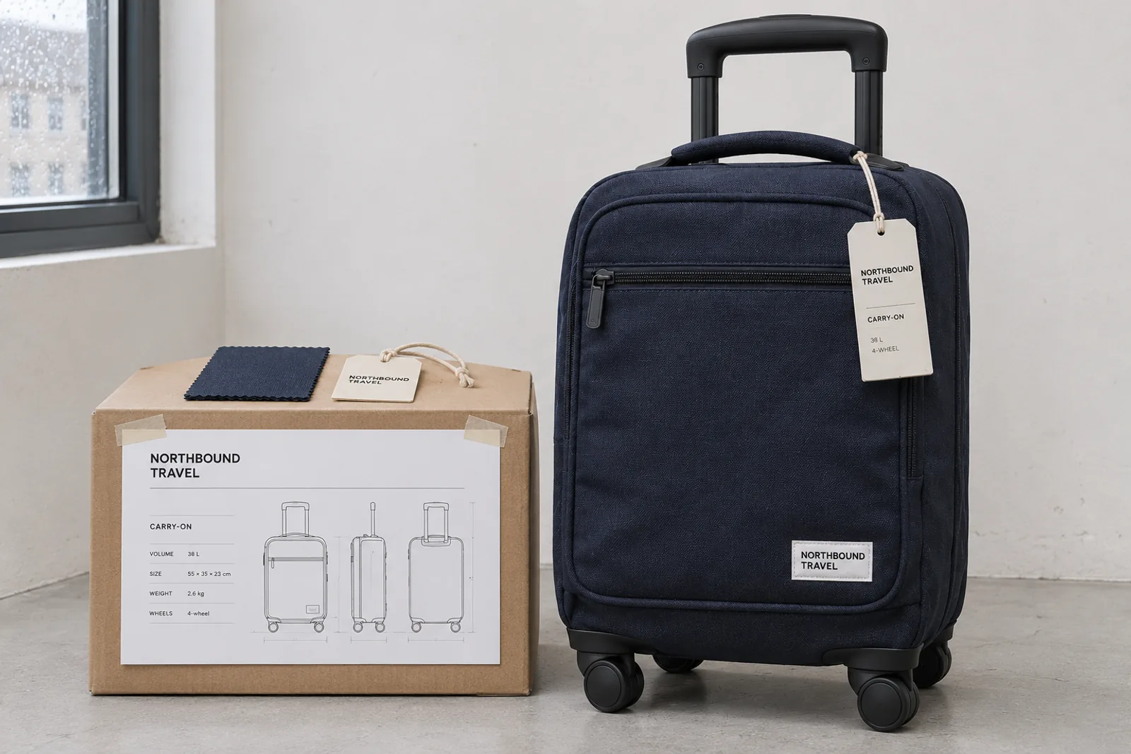
01 / Product presentation
Practical product details and a consistent photographic direction give the store a clear visual foundation.
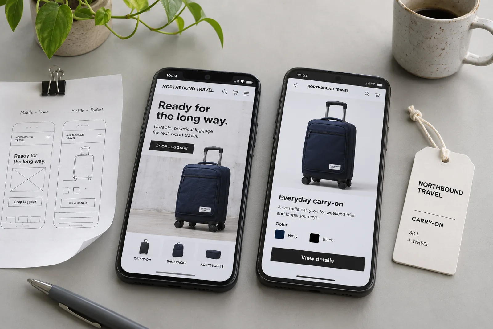
02 / The mobile experience
The same hierarchy adapted to a smaller screen, with room for the product and the information that helps people choose.
Independent concept for a fictional brand. Application photographs and mockups are AI-generated illustrative artwork.
Independent conceptFurniture business · Brand identity concept
Your idea could be next